Coachella, or “Brandchella”

What the Festival Keeps Proving About Attention

Every April, the polo fields in Indio become something closer to a brand laboratory than a music festival. The stages matter — the lineups are real, the performances are worth the trip — but the conversation that follows among marketers, strategists, and creative directors tends to center on something else entirely. It centers on what the brands built, and whether it worked.

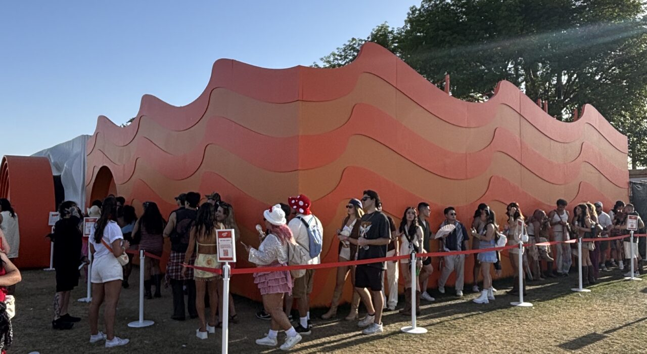
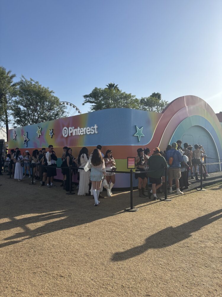
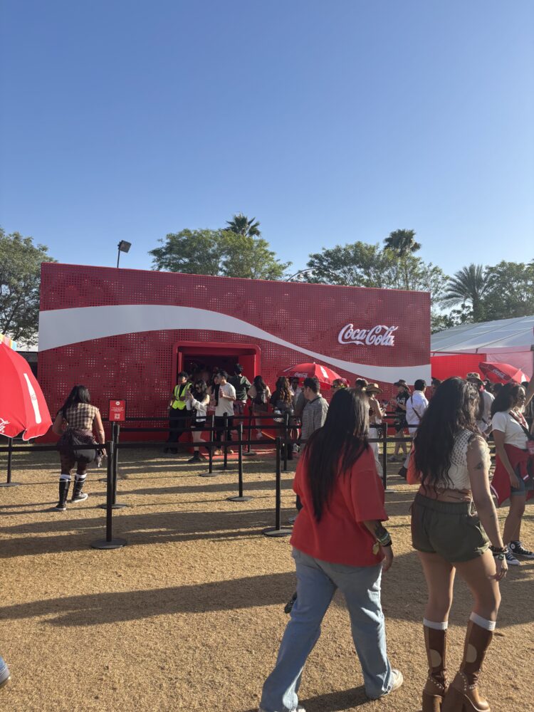
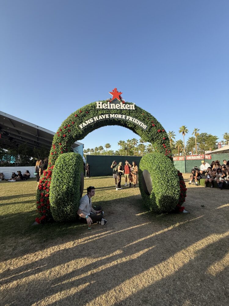
This year, Cramer sent Business Insights Strategist Johanna Beirne to find out. Not to catalog what was there, but to understand why certain activations stopped people and others didn’t — and what, if anything, that answer transfers to the conference rooms, general sessions, and client summits that define the B2B experiential calendar. What she brought back was less a trend report and more a single, clarifying observation: the activations that drew the longest lines at Coachella 2026 weren’t the ones with the most to say. They were the ones that gave people somewhere worth being before they communicated anything at all.

Shape Makes the First Argument. Everything Else Follows.

The Aperol activation made this point with unusual clarity. Its undulating coral wave structure — warm gradient, organic ridges, no legible brand name visible until you were nearly at the door — generated a queue that wrapped the perimeter. Not because of what was inside, not because of any promise made on signage, but because the form itself communicated that whatever was in there was worth the wait. Aperol’s fourth year as the official spritz partner at Coachella produced their most physically distinctive footprint yet, and the crowd responded accordingly.

A Place and a Display Are Not the Same Thing

The brands that built the most durable presence this year weren’t the ones with the biggest footprints. They were the ones that understood the difference between giving people something to look at and giving people somewhere to be. Pinterest erected a full arched pavilion — gradient, starred, structurally distinct from everything surrounding it — that read less like a brand tent and more like a destination with its own reason to exist. The queue that formed wasn’t incidental. It was the result of a design decision made months earlier, when someone chose to build a place rather than erect a display.

Coca-Cola made the same call through a different visual language. Their structure pressed the brand’s iconic wave directly into its perforated red facade, scaling a familiar mark into something architectural — a thing you approached and entered rather than glanced at and passed. The brand didn’t announce itself. It built itself into the environment and let the environment do the persuading.

For anyone designing a B2B event environment, the transfer is direct. The question isn’t “where does the logo go?” It’s “what does this space make someone want to do the moment they see it?” Those are genuinely different design briefs, and they produce radically different results.

Heineken Didn’t Build an Activation. It Built a Position.

Heineken showed up at Coachella 2026 with three distinct executions, and the coherence across all of them was itself the argument. Their hedgerow headphone arch — a full topiary sculpture shaped like oversized headphones, framing an open walkway with the line “Fans Have More Friends” — functioned as architecture, photo moment, and brand statement simultaneously. It didn’t explain the idea. It embodied it.

Their 0.0 installation worked in a different register. Two large topiary numerals stood in the ground — one marked Nectarine Juniper, one Cold Pressed Lime — giving attendees a physical choice before they’d processed a single word of messaging. It was a product awareness moment and a social content driver, but it pointed toward something larger happening across Heineken’s full footprint. Inside Heineken House, the brand was handing out mini cans of 0.0 in both flavors and running a Flavor Lab where attendees could customize their pour with botanical additions. Taken together, the outdoor sculpture and the interior experience told the same story: that not drinking was as considered a choice as drinking, and that Heineken had built a place where both were equally welcome.

That positioning isn’t accidental. Alcohol consumption among U.S. adults under 35 has declined steadily over two decades — in 2023, just 62% of young adults reported drinking, down from 72% in 2003. A growing segment of festival-goers now moves fluidly between drinking and not drinking within a single event, a behavior researchers have started calling “zebra-striping.” Heineken read that shift early and gave 0.0 equal physical presence — in the ground, at the bar, in the hands of people walking the polo fields. The message wasn’t printed anywhere. It was expressed through what the brand chose to build and where it chose to put it.

The third execution ran on technology. The Clinker — a smartband that wraps around a Heineken can and syncs with Spotify or YouTube Music data — lights up when two wearers clink drinks and their musical tastes align. Heineken’s brief emerged from a specific tension identified in their own research: 97% of people believe music unites people, but 80% say the connections they form at a music festival don’t last beyond it. The Clinker was designed to close that gap, turning a moment of shared physical proximity into something that could outlive the weekend. Success, per Heineken’s US marketing VP, wouldn’t be measured in impressions or dwell time — it would be measured in whether the relationships sparked at Coachella persisted after the dust settled in Indio.

What makes Heineken’s presence worth studying isn’t any single execution. It’s that all three spoke to different audience needs without contradicting each other. The arch told you what the brand stood for. The 0.0 installation told you who the brand was making room for. The Clinker told you what the brand wanted to make possible. Three touchpoints, one coherent argument — and that kind of thinking rarely emerges from a brief that starts with “where does the logo go?”

Your Audience Has Already Been Here

The executives, managers, and practitioners walking into your next general session have been somewhere like this. They have stood in a queue for a coral wave structure because the shape earned it. They have walked through a topiary arch because the form invited them. They have drifted toward a seven-story tower for no reason they could name. Their frame of reference for what a physical branded environment can do has been calibrated by experiences that had no interest in playing it safe.

They are not arriving at your event with low expectations. They are arriving with the expectations Coachella set — and they will feel the gap between those expectations and what most B2B environments deliver, even if they never say so out loud.

None of what worked at Coachella this year required a festival budget or a polo field. It required a design philosophy that treats environment as the opening argument rather than the supporting material. The brands that understood that — the ones that built places rather than displays, that expressed their values through form rather than signage, that designed for the audience they were trying to reach rather than the audience they assumed they had — didn’t have to compete for a crowd.

The crowd came to them.

Have a project in mind?